 (Image via
The colors in our homes do far more than decorate; they shape our moods, emotions, and overall sense of well-being. Understanding color psychology allows us to design spaces that not only look beautiful but also support our mental health. Whether you want a serene bedroom to promote restful sleep, a vibrant home office for productivity, or a cozy living room to foster connection, color is a powerful tool to align your home’s atmosphere with your emotional needs. This guide explores how different colors influence mental well-being, ways to use them effectively in different rooms, and tips for personalizing your home to reflect your unique tastes and needs.
The Power of Color Psychology in Home Design
Colors evoke emotions in profound and often subconscious ways. Cool tones like blue and green can calm the mind, while warm hues like red and orange energize and motivate. Neutral shades provide balance and often create a sense of safety and comfort.
When designing spaces, considering the psychological effect of colors can enhance your mood and fit the function of each room. Whether through paint, furniture, or decor, color can be thoughtfully applied to create a home that nurtures mental well-being.
The Science Behind Color and Mood
Studies confirm that colors activate emotional and cognitive responses. For example, blue is associated with calmness because it mirrors the tranquility of the sky and ocean. On the other hand, red is linked to energy and passion due to its association with fire and warmth. While cultural and personal experiences influence how we perceive colors, their psychological impact remains universal.
Using Calming Colors for Relaxation
Creating a peaceful oasis starts with using calming colors that encourage relaxation and reduce stress. Bedrooms, bathrooms, or meditation spaces benefit the most from these tranquil hues.
- Blues and Greens
- Soft blue tones, such as sky blue or powder blue, promote a sense of calm and can even lower blood pressure and heart rates. Light greens, inspired by nature, carry a similar effect, evoking the freshness of trees and fields. These colors work beautifully in the bedroom to foster restful sleep or in a bathroom for a spa-like retreat.
- Decor tip: Layer different tones of blue or green through textiles like bedding and rugs to add depth while maintaining tranquility.
- Soft blue tones, such as sky blue or powder blue, promote a sense of calm and can even lower blood pressure and heart rates. Light greens, inspired by nature, carry a similar effect, evoking the freshness of trees and fields. These colors work beautifully in the bedroom to foster restful sleep or in a bathroom for a spa-like retreat.
- Cool Neutrals
- Colors like soft gray, beige, or off-white add a subtle elegance while soothing the senses. These tones pair well with natural materials like wood or linen for a grounded aesthetic.
Energizing Hues for Productivity
Bright, energizing colors are perfect for spaces where focus and creativity are needed, such as home offices or exercise rooms. Incorporating bold hues helps stimulate both mind and energy levels.
- Yellows
- Yellow symbolizes happiness, optimism, and mental clarity. It’s ideal for workspace walls or accents, as it stimulates focus and sparks creativity. However, stick to muted yellows or use vibrant tones sparingly to avoid overwhelming the space.
- Reds and Oranges
- For rooms that thrive on energy, consider incorporating red or orange accents. Red encourages passion and determination, while orange evokes enthusiasm. These colors work well on accent walls, furniture, or decor in a home gym or office.
- Decor tip: Use bold colors in smaller doses to maintain balance. A red area rug or orange desk accessories can energize a space without being overpowering.
- For rooms that thrive on energy, consider incorporating red or orange accents. Red encourages passion and determination, while orange evokes enthusiasm. These colors work well on accent walls, furniture, or decor in a home gym or office.
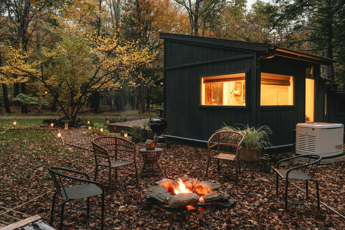
Warm Tones for Welcoming Spaces
Communal areas like living rooms and dining rooms benefit from warm, inviting tones that create a sense of comfort and connection. These colors are ideal for encouraging interaction and making guests feel at ease.
- Earthy Shades
- Terracotta, burnt orange, and muted reds mimic the warmth of natural elements, fostering coziness and connection. These shades work beautifully in open-concept floor plans or as paint colors for accent walls.
- Soft Yellows and Creams
- Lighter warm tones like butter yellow or creamy beige create sunny, cheerful atmospheres while remaining subtle. Consider incorporating these tones through furniture like sofas, curtains, or upholstered chairs in social spaces.
- Decor tip: Pair warm tones with textured materials, such as woven baskets or plush throw blankets, for a layered, comforting look.
- Lighter warm tones like butter yellow or creamy beige create sunny, cheerful atmospheres while remaining subtle. Consider incorporating these tones through furniture like sofas, curtains, or upholstered chairs in social spaces.
Balancing Bold and Neutral Colors
Although bold colors can add energy and character, using too many can overwhelm a space. To create balance, combine vibrant tones with grounding neutral shades, offering the eye a place to rest and ensuring the space feels cohesive.
Create a Focal Point
One approach is to use bold colors sparingly to highlight focal points, such as painting one wall deep green in an otherwise neutral room. This technique draws attention without dominating the entire space.
Layer Neutrals
Using neutral hues like soft grays, taupes, and whites as the base palette provides a calming backdrop for pops of color. Accessorize with throw pillows, art, or ceramic vases in brighter tones to inject personality without oversaturation.
Incorporating Color Through Paint, Furniture, and Decor
Color isn’t limited to wall paint. Incorporate hues throughout your home in a variety of ways:
- Paint: Opt for non-toxic, low-VOC paints to create a healthier indoor environment.
- Furniture: Choose bold-colored armchairs, tables, or shelving that stand out against neutral walls.
- Decor: Bring in color through artwork, textiles, or plants.
- Lighting: Add colored lampshades or LED bulbs with adjustable tones to subtly shift the room’s ambiance.
Experimenting with these elements allows you to easily refresh a space without committing to a full redesign.
Personalizing Color Choices to Enhance Mental Well-Being
Every person’s relationship with color is unique, shaped by culture, memories, and personal taste. While general principles of color psychology provide a helpful starting point, the most effective designs align with your preferences and emotional needs.
- Tune Into Your Responses: Notice which colors consistently bring you joy or calm. If you find deep purple soothing, trust that instinct and integrate it into your personal spaces, such as your bedroom or reading nook.
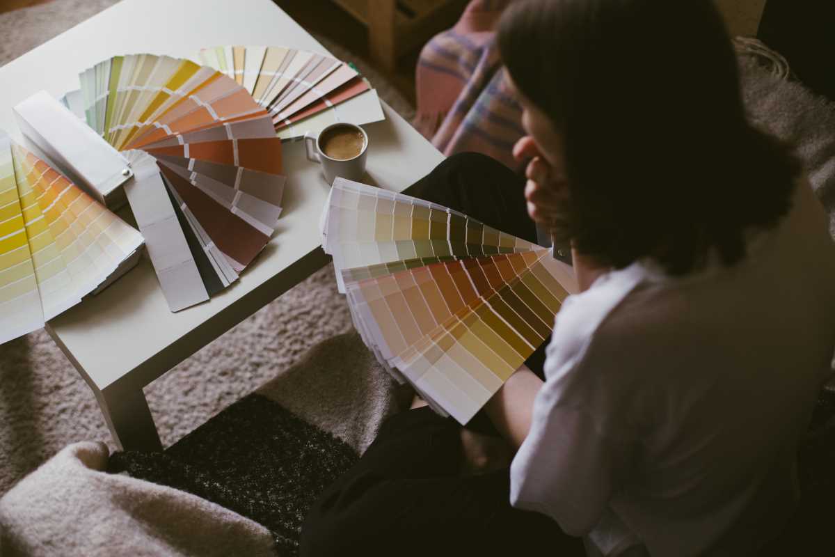
- Experiment with Samples: Before committing to a wall color or large piece of furniture, test small swatches or place colorful decor in a room to observe how different hues affect your mood in varying lighting throughout the day.
- Be Open to Change: Your emotional needs may evolve over time, and so can your home. Repainting walls, swapping throw pillows, or updating curtains are easy ways to refresh color schemes to align with changing preferences.